WORK
Case studies in product design, systems thinking, and measurable outcomes across infrastructure, mobile, and web.
AIStor Console - V2
The Vision
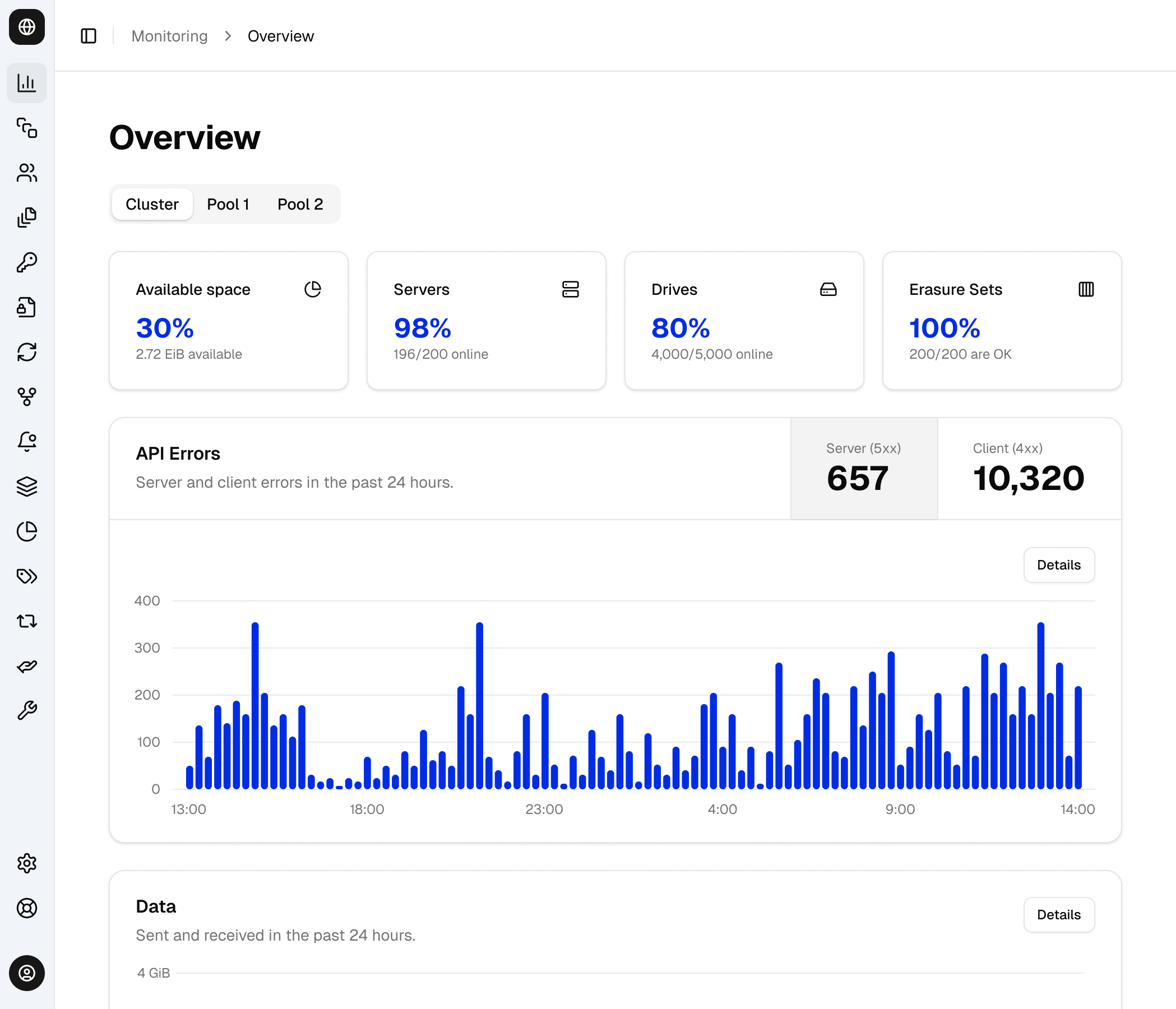
AIStor is an enterprise-grade exabyte-scale data store built for organizations running demanding AI training, inference, and analytics workloads. The AIStor Console is the browser-based management interface. This project spanned defining a new design system, product design, and pioneering a new engineering & design flow.
We set out to rapidly rebuild the product from the ground up free from legacy constraints, establishing an engineering-first process that leveraged established components to result in a cohesive product.

AIStor v2 Reimagined.
Use The Right Tool For the Job
To accelerate initial design concepts, I chose a pre-built shadcn-based Figma component library rather than building a system from scratch, allowing us to iterate quickly on the overall look without an excess of foundational UI work.
While core designs like component appearance, typography, and navigational structure were built Figma first, individual sections were prototyped by backend engineers using Claude. Style information was migrated from Figma to the codebase via Figma’s MCP.

Shadcn Design Library — Figma components mirroring the React implementation.
Feature Rich But Lacking Polish
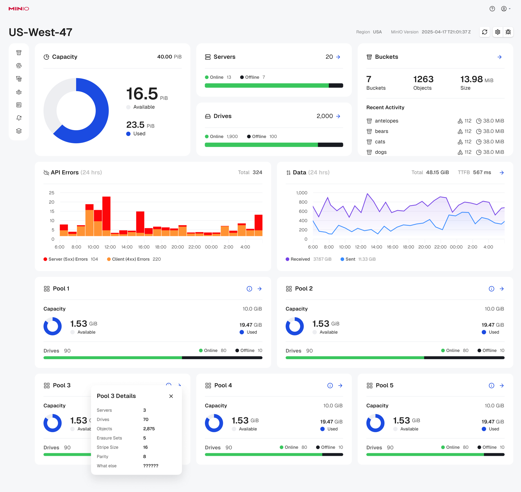
Initial prototypes created a great starting point for surfacing information and features that would have normally required considerable interview time with engineers. However, even with multiple review sessions and iterations, the consistency of the product and overall UX was not where we wanted it.

Initial designs had excessive and unorganized information.
Creating a Figma ↔ Code Loop
Instead of trying endless Claude & code iterations, it made more sense to bring the prototypes into Figma where precise changes could be made and translated back to code. This was done with a custom utility to extract application page/content states and a plugin to import into the Figma canvas.
Our new process worked very well. The initial prototypes gave myself and stakeholders a set of building blocks which, when brought into Figma, allowed for rapid exploration to decide on a final design.

Reorganized information and presentation to improve understandability.
Website Design System
A Website That Outgrew Itself
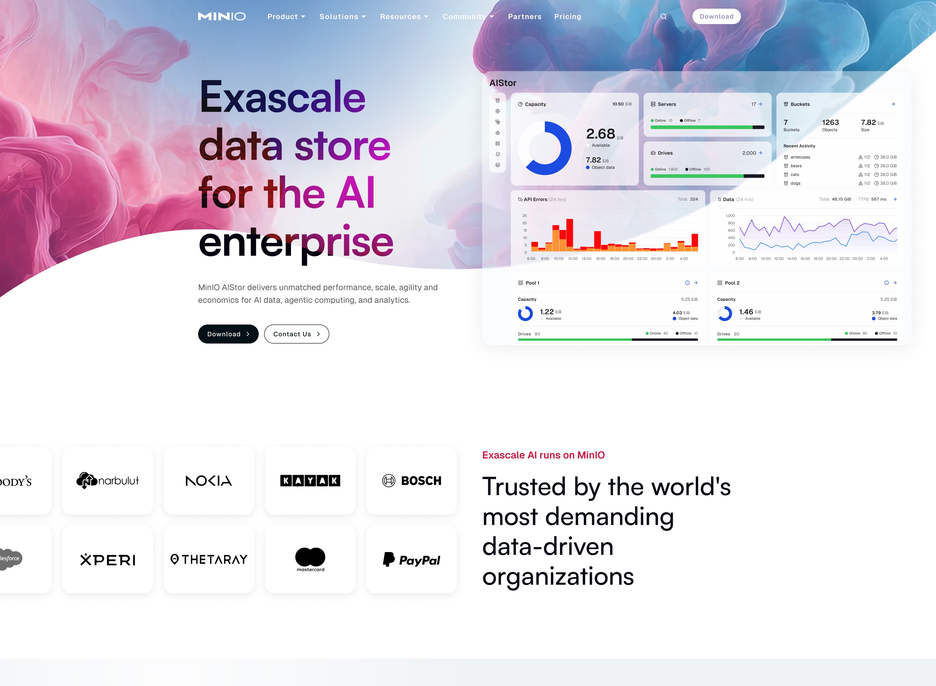
The MinIO website had grown organically, resulting in a fragmented visual language and an increasingly difficult to maintain codebase. New pages often meant reinventing the wheel and potentially breaking something upstream. Content creation was bottlenecked by design, slowing every campaign, launch, and update.
I was brought into the project to help build a new site that would support rapid content development, enforce consistency, and allow non-designers to create quality pages.

Exploring a New Look
I led the redesign of the homepage as a way to establish a visual direction that leadership felt confident rallying behind and that could scale across the full site. The goal wasn’t just to refresh a single page, but to define a style that would set the tone for the broader redesign. Through exploration and iteration, we developed foundational patterns that became the building blocks for the rest of the site.

Designing a New System
I used Untitled UI as a starting point for base and layout components, then evolved it to fit our brand and product needs. Leveraging an existing system allowed me to move quickly without reinventing foundational pieces. It also made it easy to experiment with styles and see how visual changes rippled across elements, helping us make more confident decisions about the overall look and feel.

Building The New Site
I led hands-on workshops with our content team to walk through the new system and show them how to confidently build within it. Once everyone was aligned, production of new content pages ramped up quickly, and the team was able to move with far more independence than before. The system held up well and proved flexible enough to support rapid growth.

AIStor Console - V1
Change of Company Focus and Direction
Before AIStor, MinIO came with a browser console with a limited set of features. However, the company was shifting directions and wanted to build an enterprise level product, eventually named AIStor.
Original MinIO Console accommodated open source community. Not enterprise customers.
Figma Design System
I led a design team in building our design system from the ground up, establishing a scalable foundation that enabled the product to move forward with clarity and speed. We developed a robust library of Figma components, defined a clear typographic hierarchy, and created a cohesive iconography system with explicit usage rules to ensure consistent meaning across the product.
By prioritizing foundational components, layout structures, and visual standards first, we were able to quickly transition from system-building to actively designing and shipping product experiences with confidence.
AIStor's design system was built from the ground up.
Building the Product
I led the team's development while also contributing as a designer, balancing strategic direction with hands-on execution. As we designed and shipped the product, we continuously evolved the design system in parallel, ensuring it adapted to real-world use rather than remaining theoretical.
I facilitated Figma workshops to help designers leverage components, variants, and advanced features effectively. In close partnership with engineering, I validated key technical decisions early and often, collaborating daily to guide implementation.
Dashboard, data views, erasure set health, and object browser.
User Impact
AIStor brought monitoring and data management access to a broader range of users. Clearly visible and easy to understand features reduced the need for reading through excessive documentation, increasing adoption for even highly technical users.

AIStor enables organizations to manage their data with ease.
Telepresence IDE Plugin
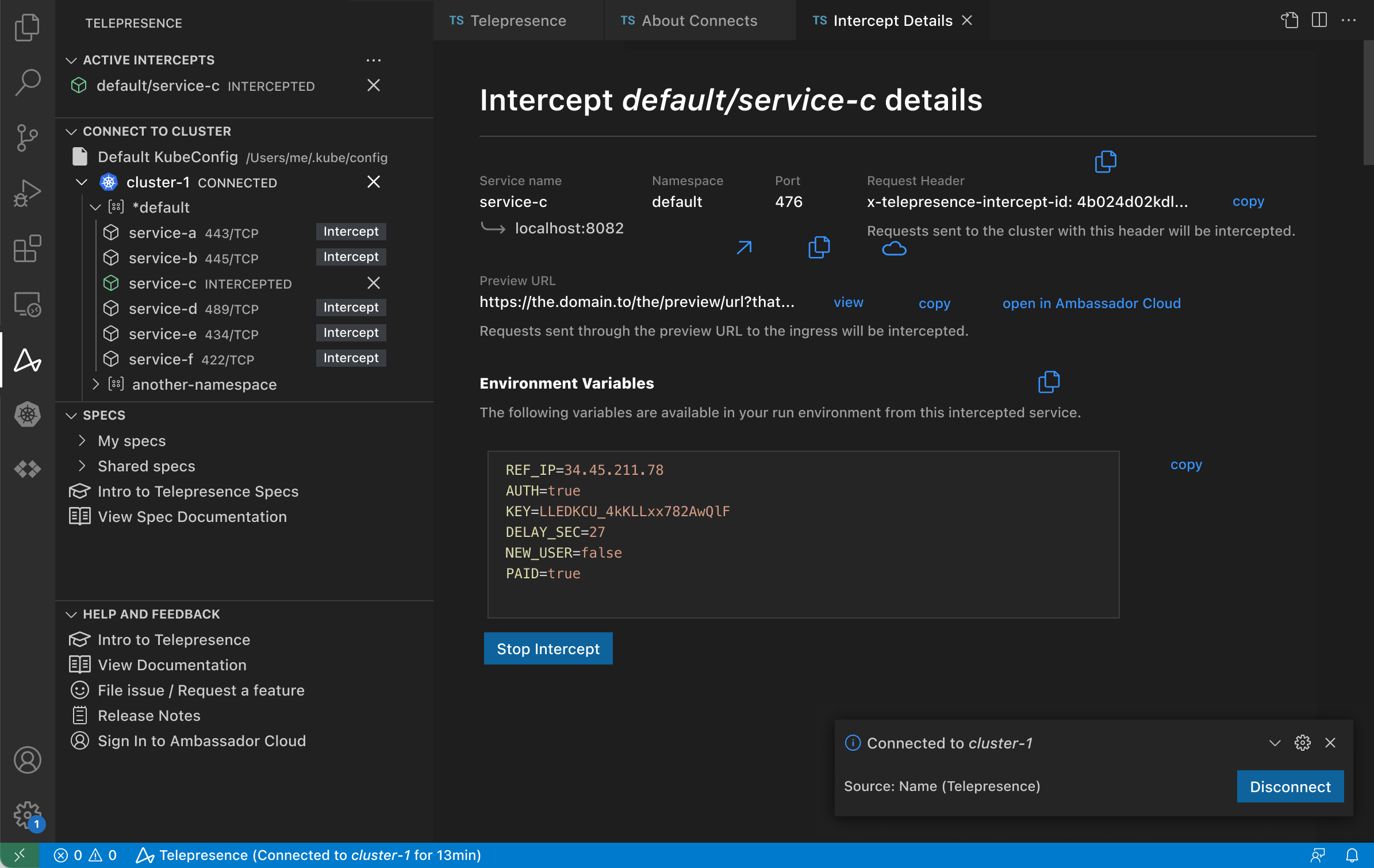
CLI Utility requires extra work
Telepresence is a powerful open-source tool that lets developers run local services in the context of a remote Kubernetes cluster. But it was entirely CLI-driven, requiring memorization of commands and context-switching between terminal and IDE. Our belief was that this was negatively impacting adoption.

Sample Telepresence CLI command.
VSCode & IntelliJ Plugins
VSCode and IntelliJ have different interface standards. Understanding the different and common elements in the beginning allowed for a similar design where possible. Due to the highly technical nature of Telepresence, and our desire to create added value, much of the design and features were a result of very close collaboration with engineering, resulting in a product that was quicker, and more convenient than a developers previous method of using Telepresence.
Key Decisions
- IDE-native conventions over custom UI
- Zero-terminal path for common ops
- Cluster topology in sidebar
Easily visible options through the UI made for a better overall experience that was easier to adopt.
Accident Scene Photo App
Redesigning A Product Failing at 14%
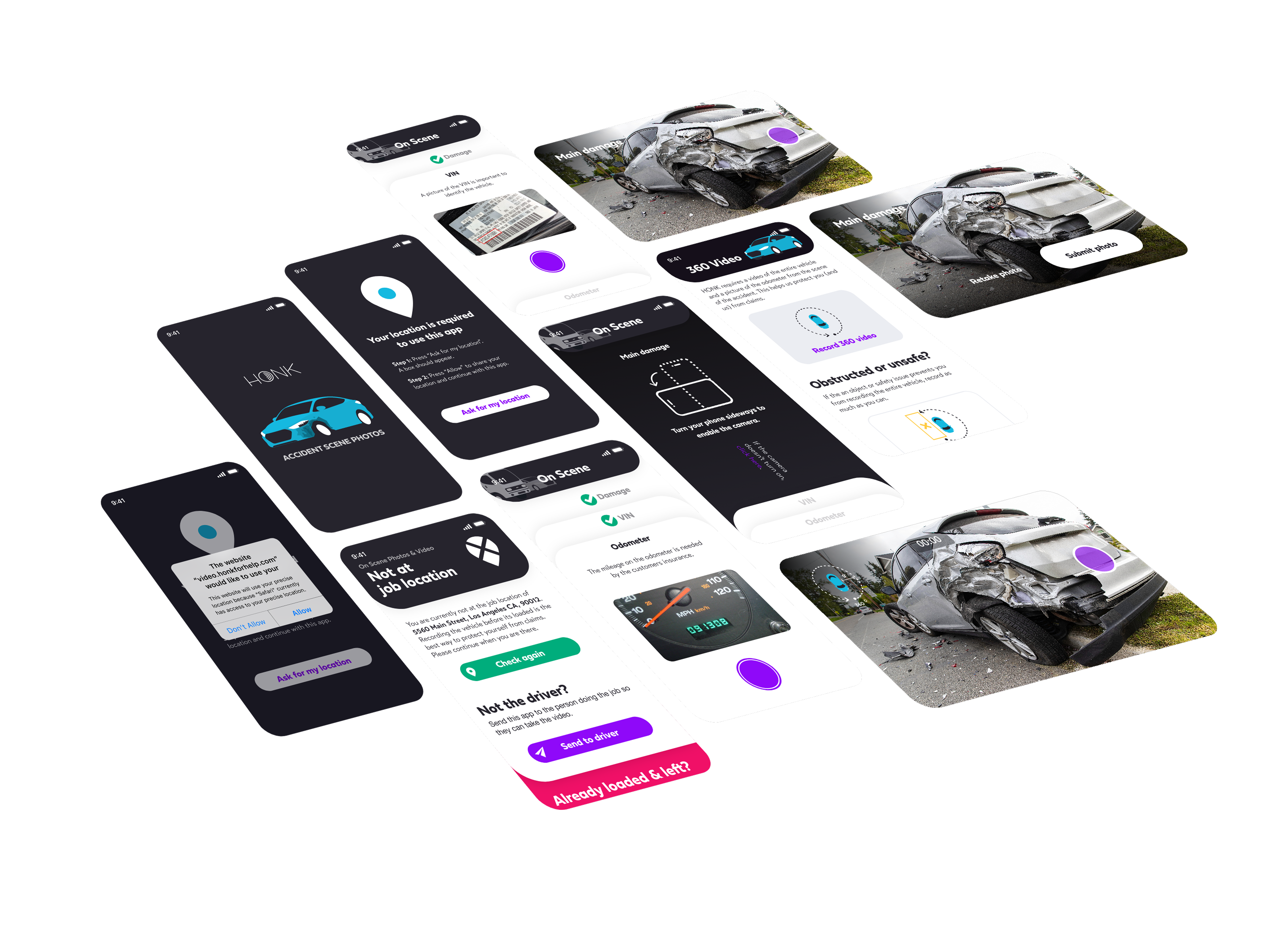
HONK wanted to collect at-scene damage photos of vehicles involved in accidents so an AI could determine total loss before a tow, routing the vehicle directly to a scrap yard and saving insurance clients money. The initial solution was a basic web form for tow operators that produced acceptable photos only 14% of the time. HONK needed that number to rise dramatically before it could offer this as a viable product to its insurance partners.

The basic web form was not enough.
Seven Barriers Blocking Good Photos
We analyzed submitted photos, cross-referenced detailed job data, and interviewed tow company owners, dispatchers, and operators to understand the failure modes. We identified seven root causes: tow operators uploading their own existing photos out of habit, safety concerns from stepping into active roadways, no perceived value in the extra step, texts going to dispatchers instead of the operator on scene, ineffective instructions, camera orientation defaulting to portrait, and photos being taken after the vehicle was already towed.

Photos submitted through the original form frequently missed large portions of the damaged vehicle, making them unusable for AI damage assessment.
From Live Detection to Intelligent Feedback
We first attempted live object detection to guide the shot in real time, increasing the acceptable photos to 35%, but older devices and poor mobile data speeds made a reliable experience impossible for too much of our user base. Instead, we redesigned the flow so photos were submitted and reviewed after capture, initially by a team member in Slack to validate the concept, then automated. Wrong photos triggered specific feedback and prompted a retake. We also added a landscape-orientation gate before opening the camera to address the portrait photo problem. The result: acceptable photos jumped from 35% to 96%, with most operators taking correct photos on their first or second try.
Key Decisions
- Post-capture review over live detection
- Manual Slack review to validate before automating
- Landscape orientation enforced before camera opens

After ruling out live object detection, post-capture review with automated feedback raised acceptable photo submission from 35% to 96%.
Going from 40% to 75% Through Integration
Improving photo quality solved only half the problem, tow operators still had to use it at the right time. The existing text-link approach was inconsistently delivered and easy to ignore. We embedded the photo requirement and a direct link inside the HONK Partner app's job details view, where operators already read job info when first assigned. An arrival push notification gave them a one-tap shortcut into the camera experience. For tow operators not using the Partner app (30% of accident jobs), we gave dispatchers a quick-share button to text the link directly to the right person. Together, these changes raised engagement from 40% to 75%. We also surfaced the captured photos in job history, giving tow companies proof-of-condition documentation they valued for liability protection.

Surfacing the photo requirement inside the HONK Partner app job details view and sending an arrival push notification drove engagement from 40% to 75%.
A Viable Insurance Product — and Lessons Learned
Through rapid 1–3 day A/B iterations, screen recordings, and ongoing tow operator interviews, the team transformed a failing MVP into a credible insurance product offering. The largest remaining opportunity was delivering more direct value to tow companies, incentivizing engagement well beyond 75%. Browser-based cameras also proved brittle: permission failures and device inconsistencies created friction that a native camera path could have avoided.
A meaningful takeaway
Proving a manual process first (human photo review in Slack) before automating saved significant engineering time and de-risked the core assumption early.

Rapid A/B iteration, screen recordings, and tow operator interviews guided every design decision from initial concept to a scalable insurance product offering.
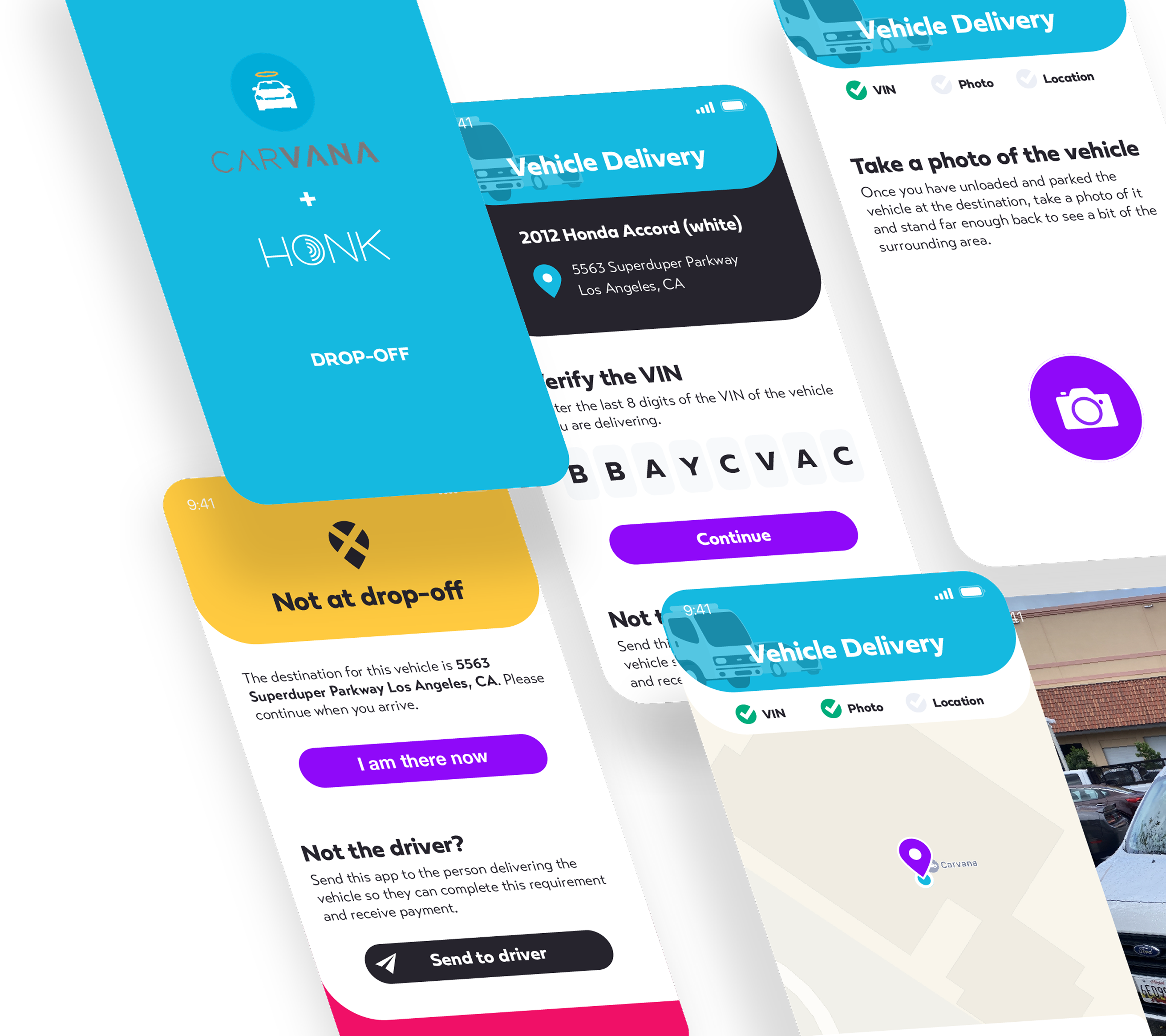
Drop-off Verification
Problem
Carvana could not find vehicles that were delivered to their storage lots.
Causes
- Tow operator indicates vehicle is delivered prematurely
- Tow operator marks the wrong car as delivered
- Carvana agents are not present during drop-off to mark where the vehicle was unloaded
Solution
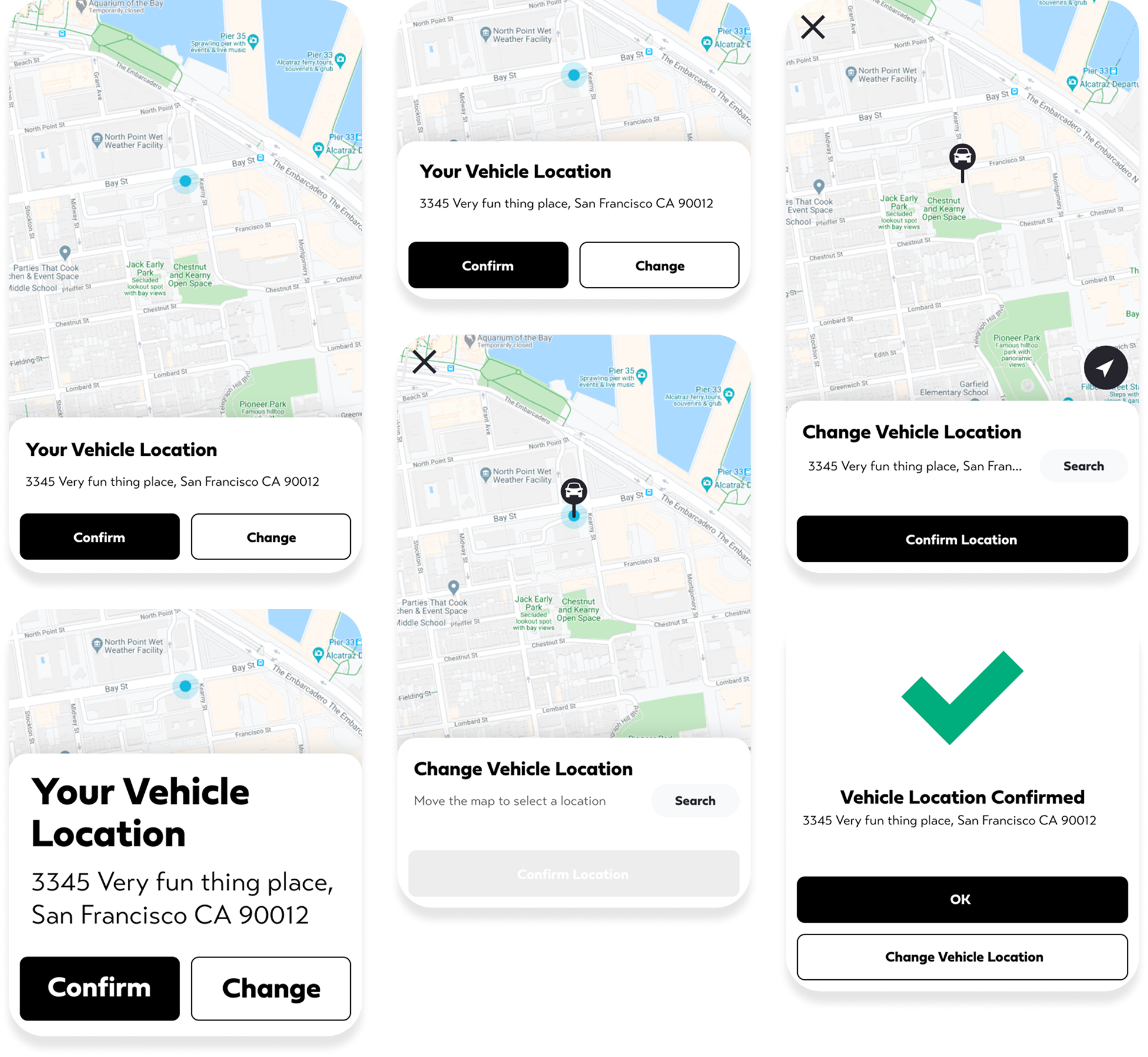
Verify the vehicle is at the correct Carvana lot (via GPS and vehicle VIN), and identify where it was left in the lot with GPS coordinates and a photo for visual assistance.
GPS confirmation, VIN scan, photo documentation — all captured in a browser-based mobile flow with no app install required.